A Nursery Tale... The Reveal...
Taa-dah!
So. This nursery reveal is either exciting for you, or you’re really bored by this entire week of 1 2 3 design posts. If the latter is the case, come back tomorrow for Palm Springs! Sunshine! Bathing suits!
Oooohh…
But if you like these posts like I do, then hopefully you’ll enjoy this one, because I SO loved creating this room for my yet-to-be-born little boy…
The crib above is the beautiful Stokke Sleepi System crib and the bedding is by Serena & Lily. My friend Megan created the clothesline name sign, my mom sewed the monkey blanket on the left, and my sister crafted the origami paper birds hanging in the window in the background.
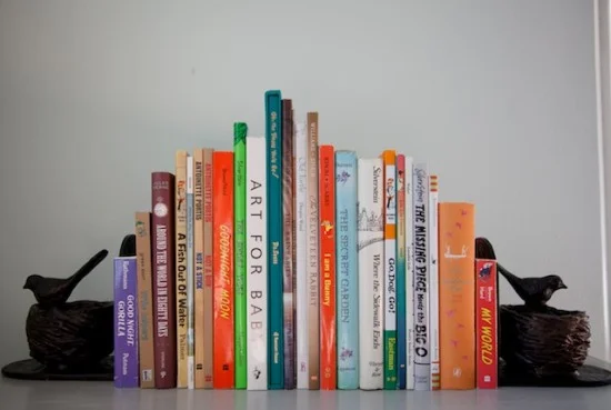
Books were a HUGE part of my childhood, so I knew they would featured prominently in my design. My baby shower invitations included a request to build Finn’s library, and these are a few of the books he was gifted by my lovely friends! (‘The Secret Garden’ was my favorite book growing up, everyone needs a copy of ‘Goodnight Moon’, and ‘Art For Baby’ is my favorite book for Finn right now)
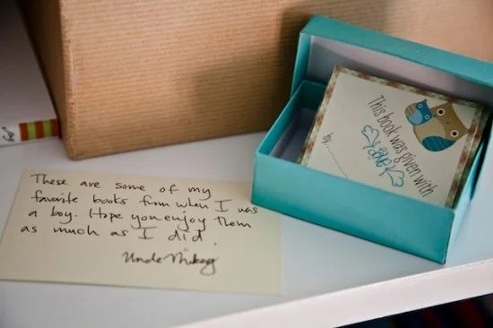
Below are the labels that the talented Jenn Wong created for people to sign and stick inside the book jackets.
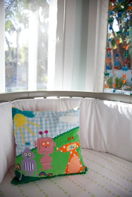
One of my favorite stores in LA is Lost & Found on Yucca Street in Hollywood. It’s a really tucked away spot that started as one tiny store, and has since expanded into 6 side-by-side storefronts filled with all sorts of original treasures. Shortly after I found out I was pregnant, I wandered in and found the most ridiculous handmade alien pillow. It’s original, weird, cute, and very me. I love it.
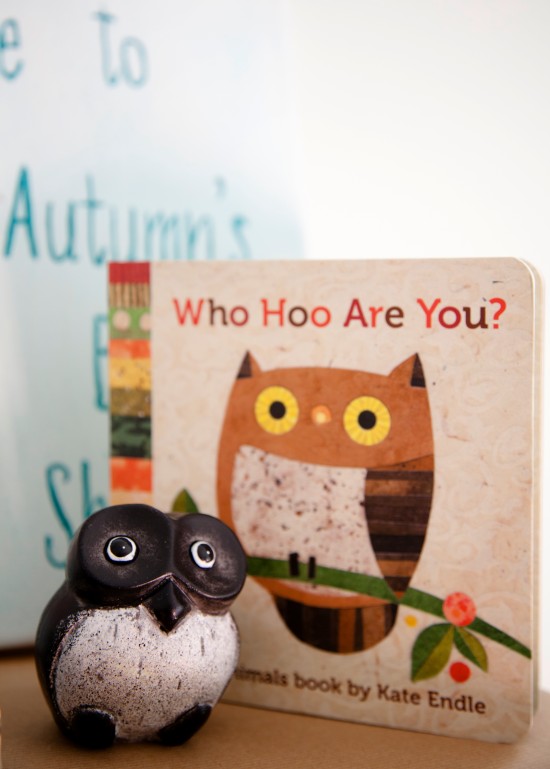
Owls were a consistent theme in my baby showers, gifts, and clothing. Here they’re poppin’ up in a cute book and a vintage sculptural piece…
Personally, I don’t think it’s weird to mix themes in a baby’s room.
We’ve got owls, monkeys, robots and aliens, and it works.
It works because it’s ours.
It’s us.
It’s Finn.
I actually think it’s weirder when people stick to one theme, like Oh, here’s a huge baseball on the crib and then another 5 as knobs on the dresser and then 8 more as decals stuck onto the walls… it’s just much less interesting. Don’t put yourself in a box—if you like something, that’s a great clue that it should be included in your room somewhere!!
Just because you like it.
That’s a GREAT reason!!!
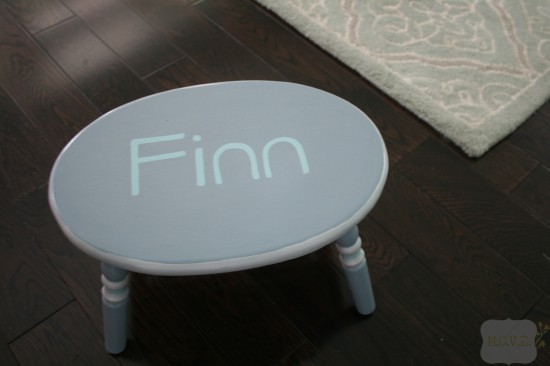
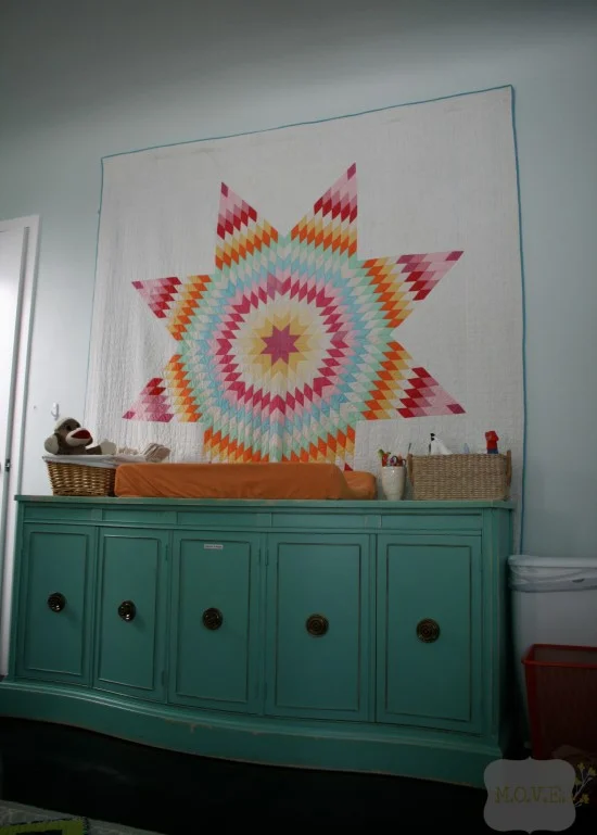
KT Steppers gifted us with this adorable step-stool for Finn!! I love it; it was the first item we owned with Finn’s name on it. One of my major inspirations for the nursery was a family quilt, an heirloom made by my great-grandmother back in South Dakota. I’ve always loved it, and thought it would fit beautifully into a modern design and color scheme. I knew I wanted to hang it on the wall, and my mom found a magnetic hanging kit at a local fabric store that she then was lovely enough to hang for me (thanks, mom!). Isn’t this quilt absolutely stunning? And isn’t it incredible to think that a woman with 10 children (10!!!) was able to find the time to raise them all, care for an entire household, do farm work, AND make an amazing treasure like this that has survived long enough to hang in her great-great-grandchild’s nursery??? It’s unreal…
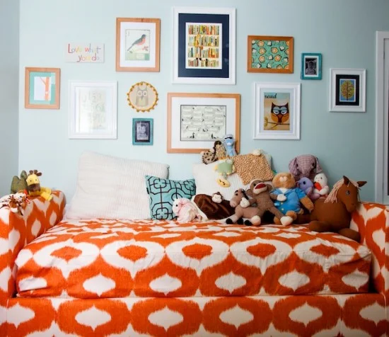
The art wall…
A few of the items up there—black & white childhood photos of Jess & me, a plaque that says ‘Love What You Do’ which was a gift from a childhood friend of mine, a family tree, a print called ‘Library’ from 20x200 Blog, our wedding program mounted on teal scrapbooking paper, and a framed baby shower card.
The orange ikat daybed is my favorite part of the room because I recklessly coveted one with abandon and now here it is in all it’s glory! I blew over half my budget on it, but it was so worth it, because it is perfection in every way (to me).
I designed it with help from my friend Matthew, found the fabric at the Pacific Design Center, and had it made by an upholstery company on East Beverly (can’t remember the name right now! I’m sorry! But they’re amazing!).
The seat is just a slipcovered cushy twin mattress, so it’s perfect for overnight guests and will serve as Finn’s bed when he gets a little older and (hopefully!) his little sister starts using the crib.
I designed it so there are no legs and the base reaches flat all the way down to the floor—that way, no toys can get lost underneath!
No crying for unreachable prized possessions!!
Minimizing Whining Through Design.
That’s my motto if I ever start a furniture company…
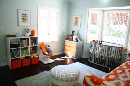
The ottoman/chakki is amazing and it’s by Serena & Lily, the rug was purchased wholesale from an interior designer friend, ( I think it’s from Candice Olsen’s line, actually), and the baby swing is the Mamaroo.
I got the orange fabric boxes on clearance at Crate & Barrel and I use them to stash all of Finn’s soft cuddly toys.
Notice there are no window treatments—yup, he naps in a bright room.
Not because I think it’s a good idea, but because I’m unable to make up my mind what I want to do.
Oh yeah, and because I blew my budget on that daybed…
More than anything tangible in the room, I really love how many people’s time & energy went into making Finn’s room special for him!!
It’s all because everyone loved this little guy before they ever even met him.
I know I did…
xoxo


